Case 01 · E-commerce · Shopify
TRIBUILD
A direct-to-trade workwear store for contractors in Ireland, the UK and the EU.A direct-to-trade workwear store for contractors in Ireland, the UK and the EU.
Visuals generated with AI

- Role
- UX/UI designer — end-to-end, demo build
- Tools
- Figma, Shopify (OS 2.0 theme), HTML & CSS, GitHub Pages, Claude (Anthropic)
- Timeline
- 2026 · launching 2027
- Team
- Solo project for a client (an Irish entrepreneur)
- My contribution
- Brief and strategy, information architecture, wireframes, design system, desktop and mobile UI, clickable prototype, Shopify theme and a working demo website
The challenge
Trade buyers shop between jobs, so the store has to be fast and clear.
The client needed a direct-to-trade workwear and PPE store for Ireland, the UK and the EU. People who buy for a job need to find the right product, size and price quickly, often on a phone.
Approach
From the first sketch to a clickable build.
- 01
Understand
Looked at how trade buyers shop and what the store has to answer on every screen.
- 02
Design
Defined the catalogue, product page and checkout in Figma, with one clear visual system.
- 03
Build
Turned the design into a Shopify theme and a live, clickable demo.
Key screens
Result
A store ready for its 2027 launch, with a clickable demo you can try now.
View live demoSummary
- A direct-to-trade workwear and PPE store for Ireland, the UK and the EU — one storefront that serves both private buyers and business accounts.
- End-to-end: strategy, IA, design system, 20+ screens for desktop and mobile, and a live, clickable demo.
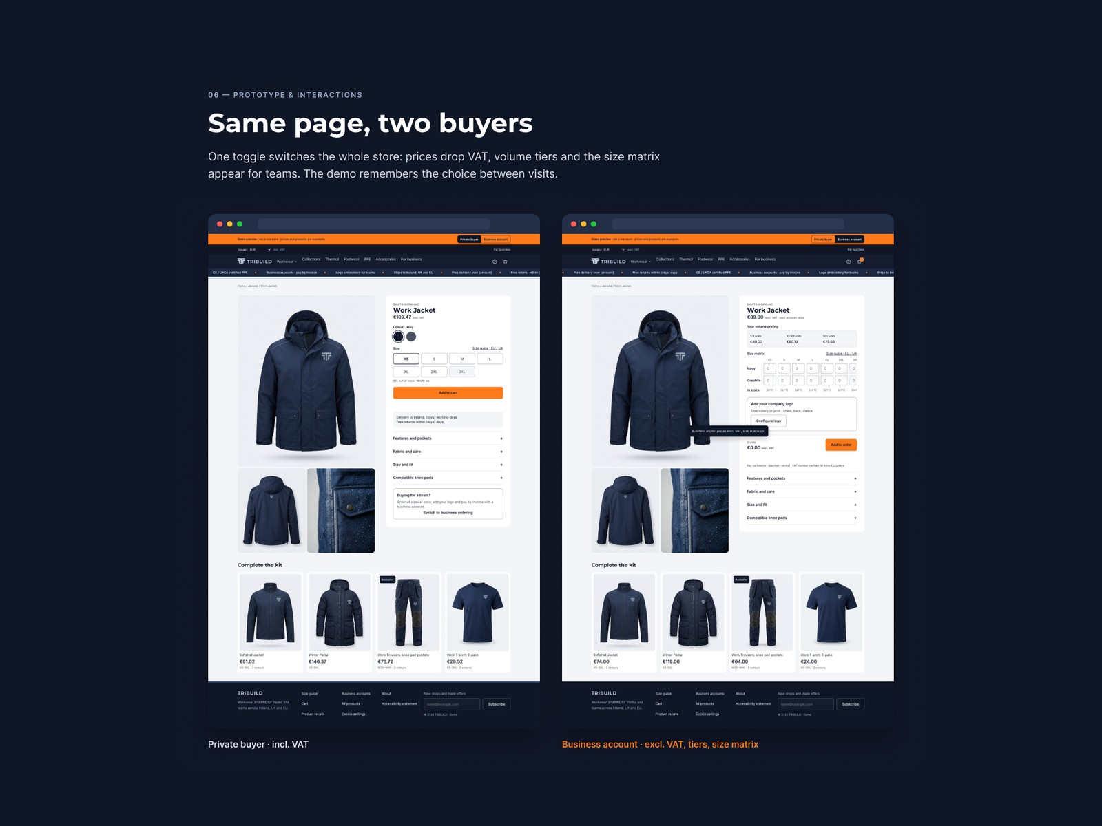
- One toggle switches the whole store between a private buyer (incl. VAT) and a business account (excl. VAT, volume tiers, size-matrix ordering).
The problem
An Irish entrepreneur commissioned a new brand of construction workwear and PPE, selling direct online. The goal: a store where a site worker finds the right jacket in a minute — and a company kits out a whole team without phone calls or spreadsheets.
TRIBUILD is the design and a working demo built ahead of a 2027 launch.
Constraints & trade-offs
Two very different buyers on one site: tradespeople paying by card incl. VAT, and businesses ordering in bulk, excl. VAT, on invoice. Three markets, two currencies, EU safety standards — and mobile use on site, often outdoors, in rain and bright light.
Process
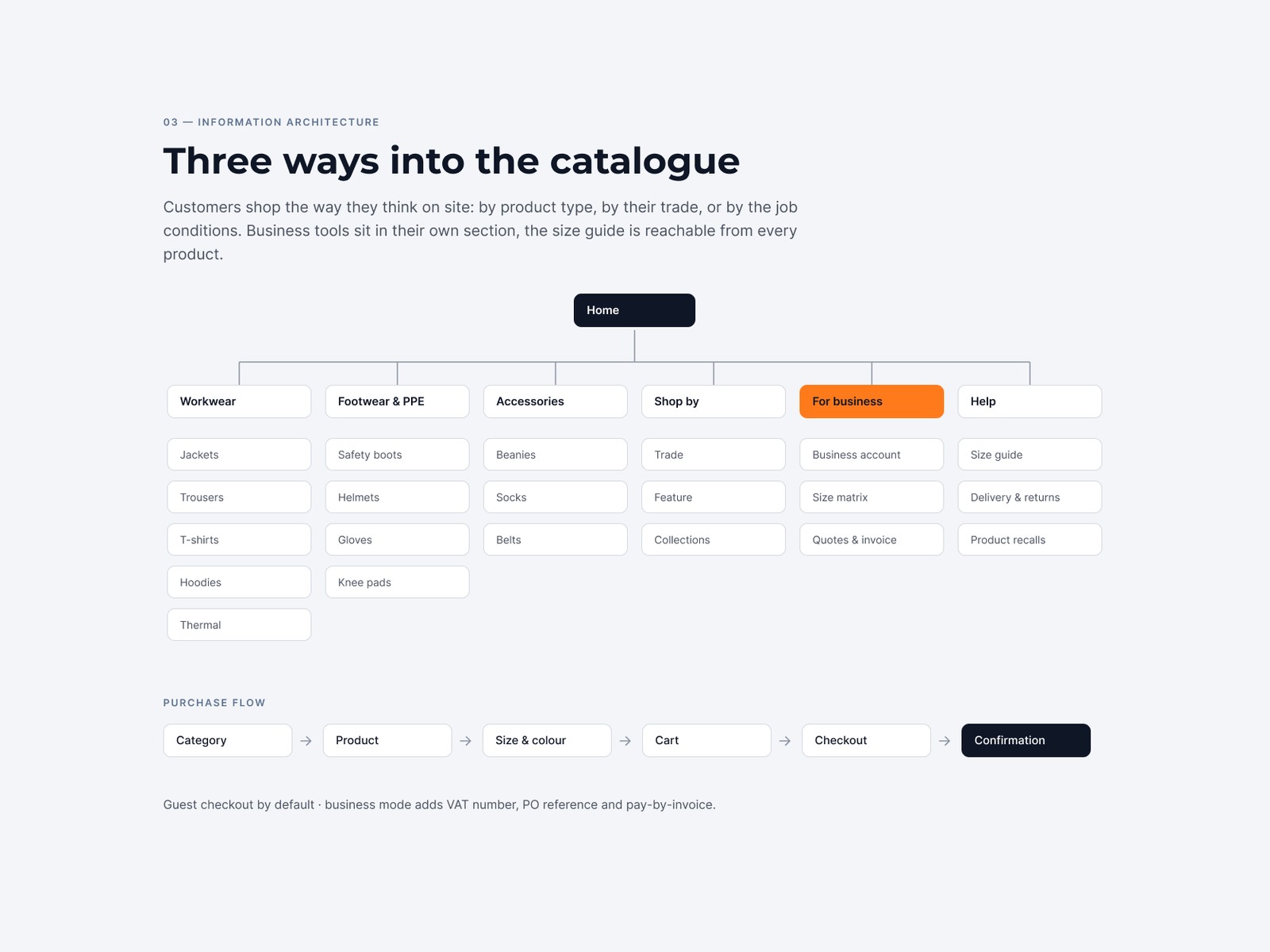
Customers shop the way they think on site: by product type, by their trade, or by the job conditions — waterproof, hi-vis, insulated. Business tools sit in their own section, and the size guide is reachable from every product. The purchase flow is a clean line: category → product → size & colour → cart → checkout → confirmation, guest checkout by default.
Key decisions
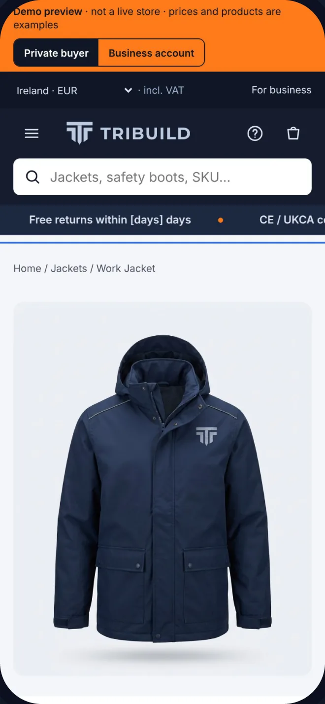
Instead of building a separate trade portal, every page switches between a private buyer and a business account with one toggle at the top. Prices, VAT and the ordering tools change; the store itself stays the same.
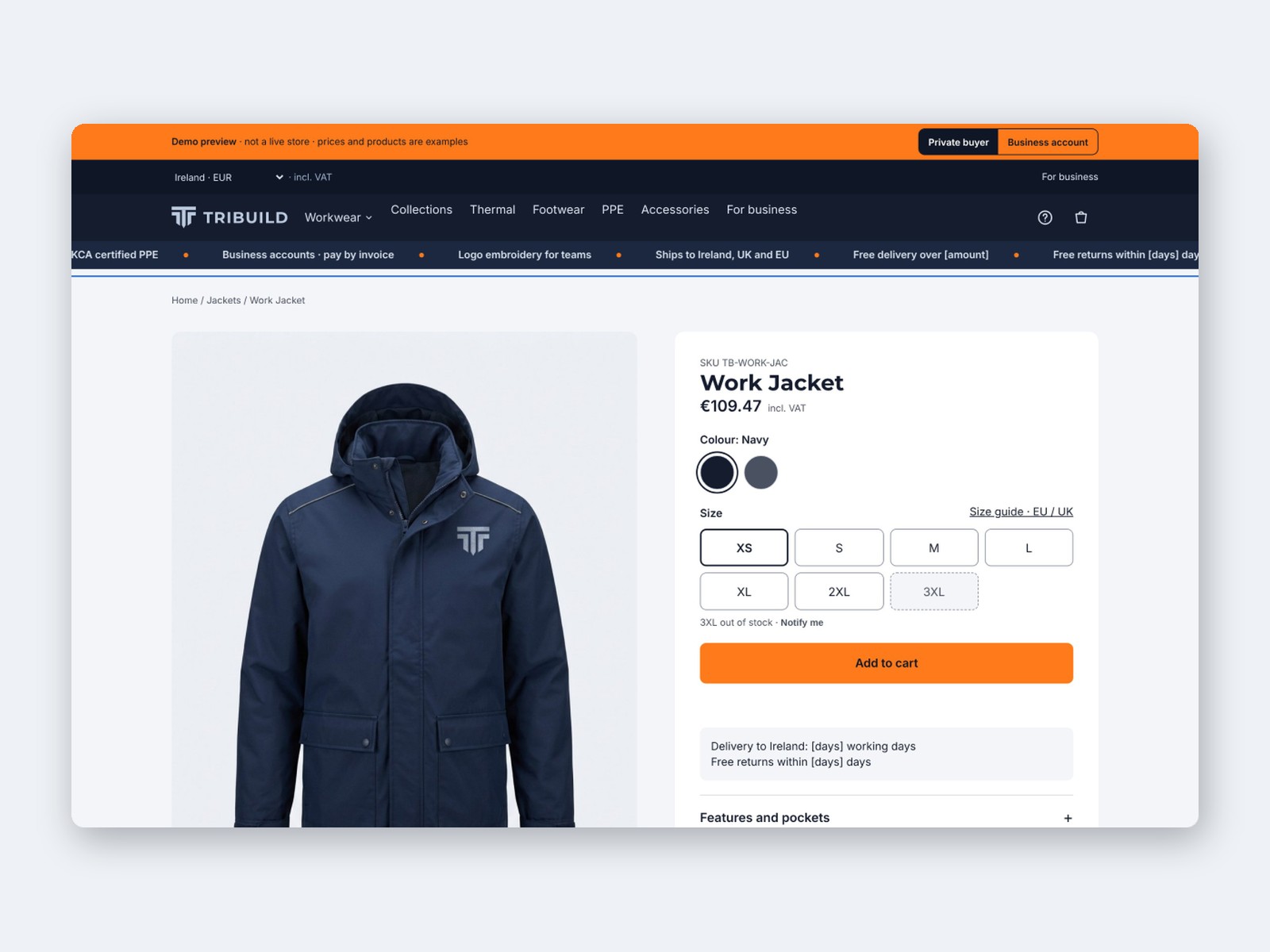
- Private buyer — prices incl. VAT, card / Apple Pay / Google Pay, guest checkout, size guide one tap away.
- Business account — prices excl. VAT with volume tiers, size-matrix ordering for teams, pay by invoice, logo embroidery for crews.
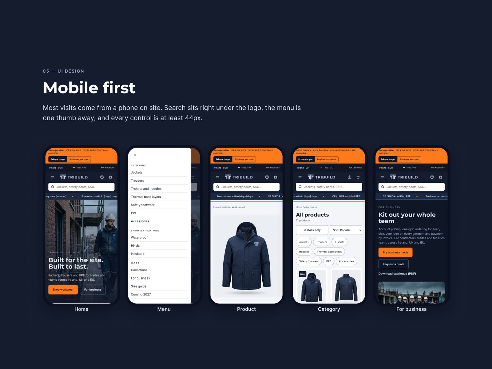
Four design principles held it together: built for the site (44px+ touch targets, high contrast, readable outdoors and with gloves), find it in a minute, trust up front (safety standards, delivery and returns before checkout) and local by default (IE / UK / EU, EUR / GBP, VAT shown correctly).
Design system
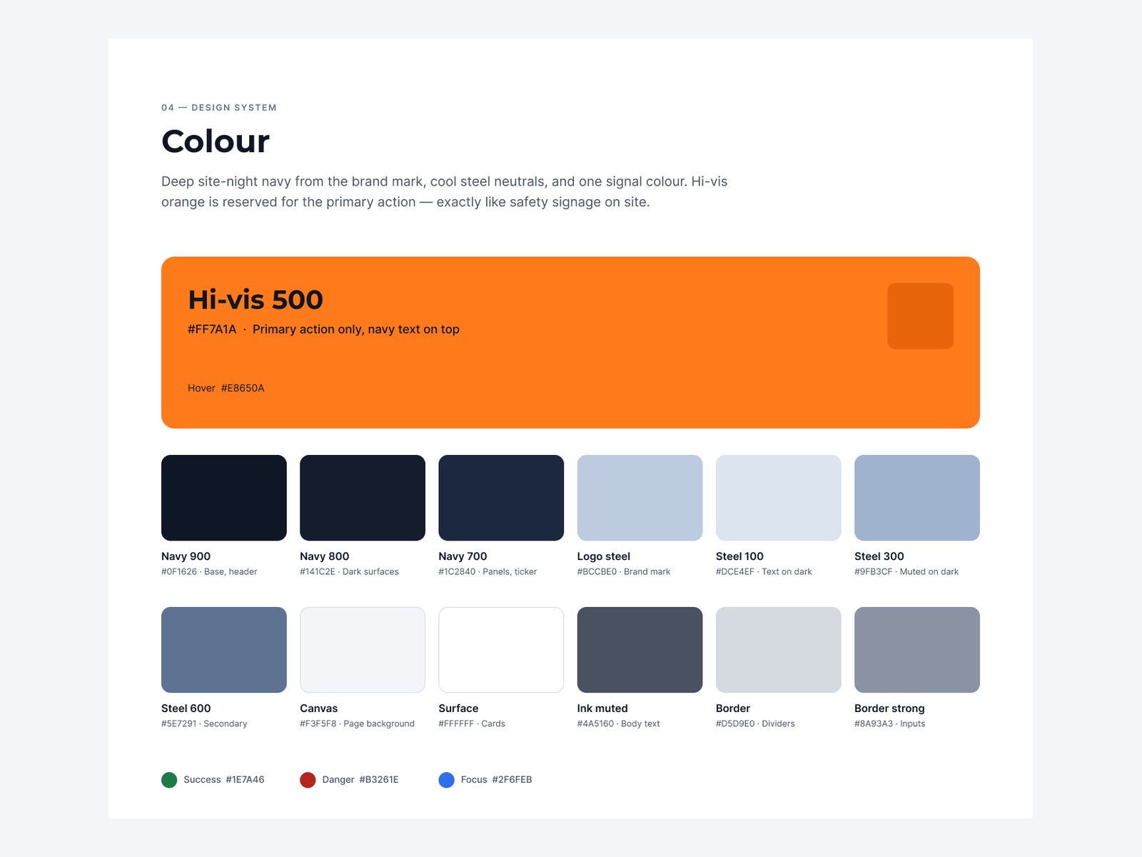
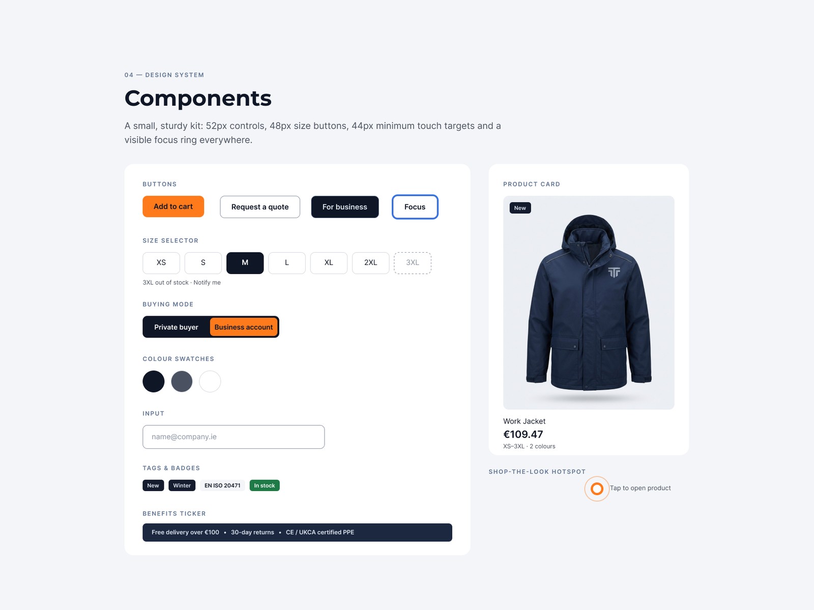
A deep “site-night” navy from the brand mark, cool steel neutrals, and one signal colour: hi-vis orange, reserved for the primary action — exactly like safety signage on site. Montserrat Bold for headlines, with letterforms that feel engineered, paired with Inter for body, UI and prices. A sturdy component kit — 52px controls, 48px size buttons, a visible focus ring everywhere — plus the buying-mode toggle, size selector with per-size stock, product cards and a benefits ticker.
The design
20+ screens across desktop and mobile: a home page with a looping hero, benefits ticker, category tiles, shop-the-look hotspots and a business call-to-action; a product page with gallery, colour and size in one view and stock shown per size; category with filters; the business section with accounts, volume tiers and invoicing; cart and size guide. Mobile-first throughout, because most visits come from a phone on site — search under the logo, the menu one thumb away, every control at least 44px.
Code
Beyond the design, I built a live, clickable demo and a Shopify OS 2.0 theme, so the toggle, the two pricing modes and the size matrix actually work — the demo even remembers the buyer’s choice between visits.
Outcome
A complete design system and a working demo store that proves the concept end to end: two buyers, three markets, one calm storefront. Demo imagery is AI-generated and art-directed, to be replaced with real product photography before launch.