Case 03 · Concept · Mobile
Aura Ride
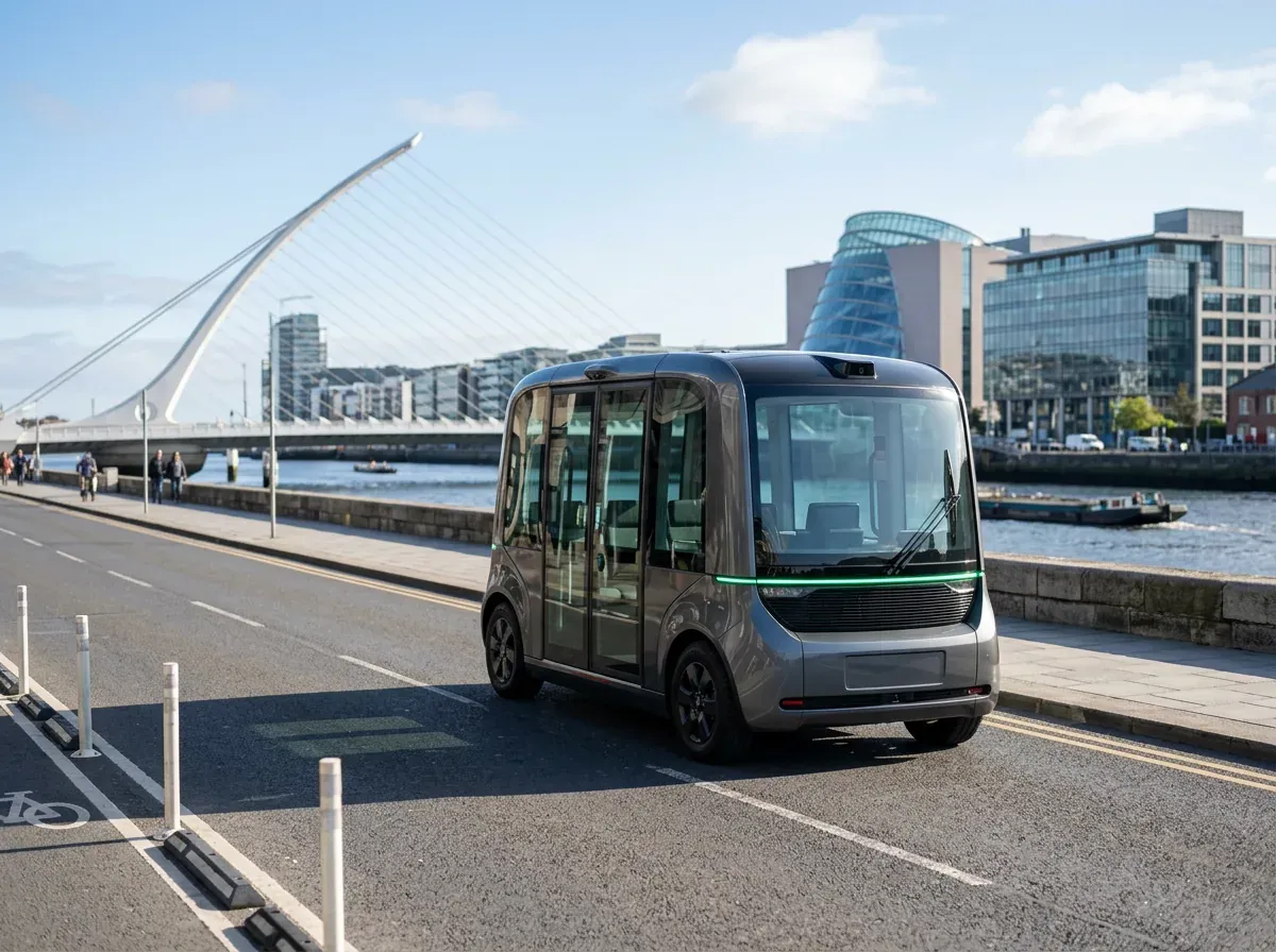
An autonomous taxi designed for the narrow streets and busy traffic of Dublin.An autonomous taxi designed for the narrow streets of Dublin.
Visuals generated with AI

- Role
- Product designer — product strategy, UX/UI, design system
- Tools
- Figma, Claude (Anthropic), AI image generation for concept visuals
- Timeline
- 1 month
- Team
- Solo project
- My contribution
- Positioning, user flow, wireframes, four core iOS screens, a 42-component design system and concept visuals
Gallery
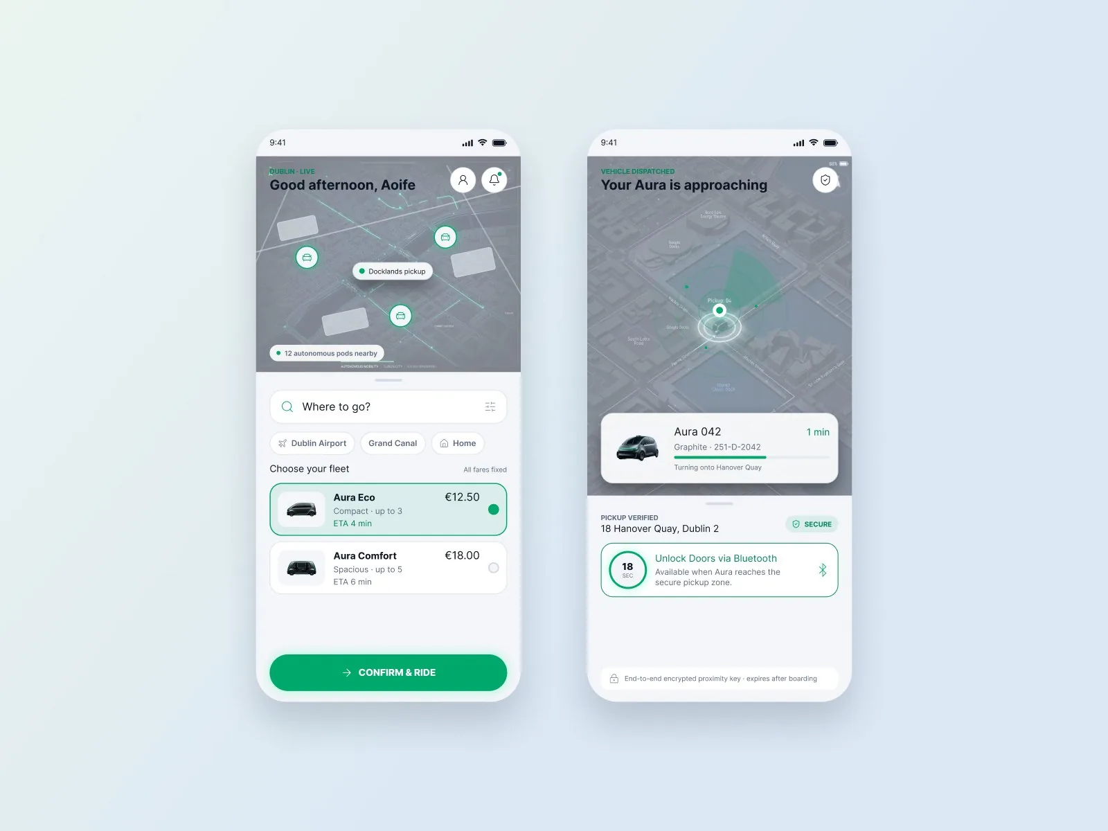
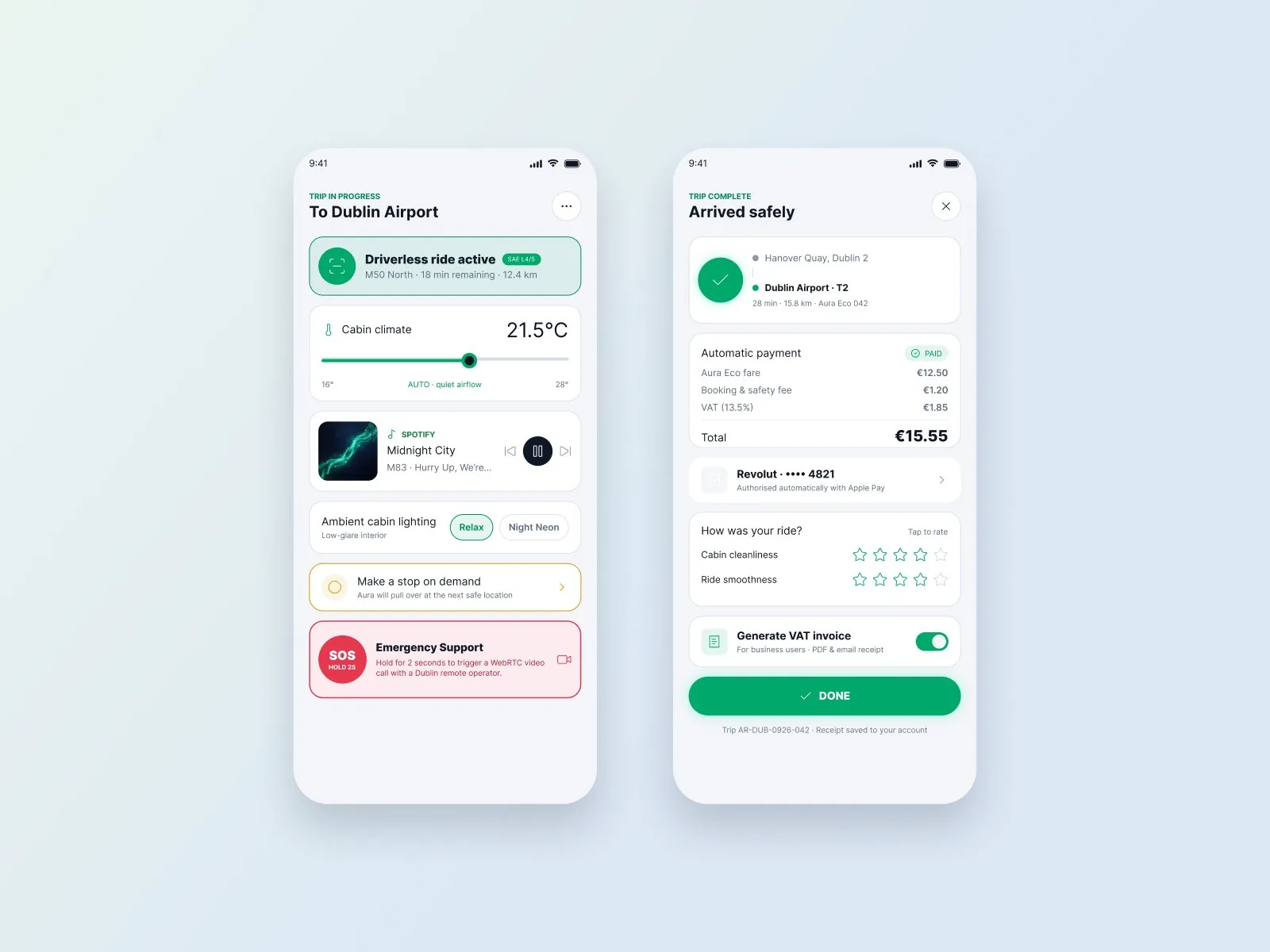
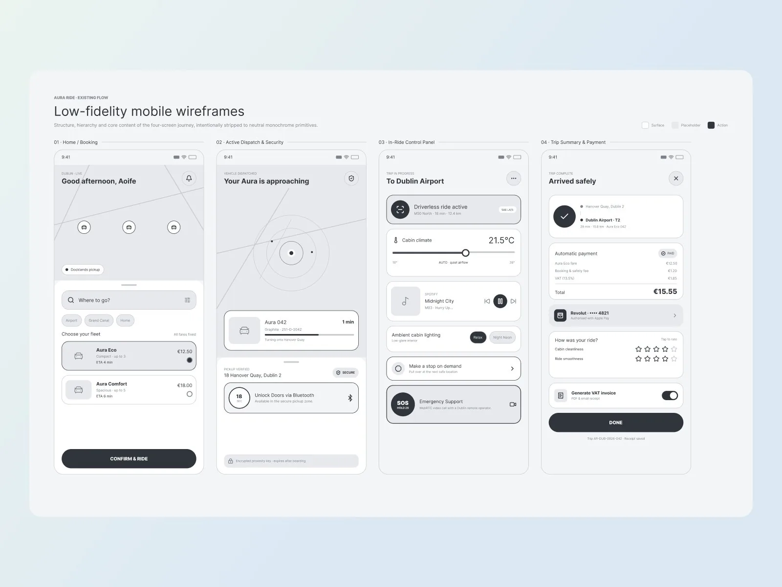
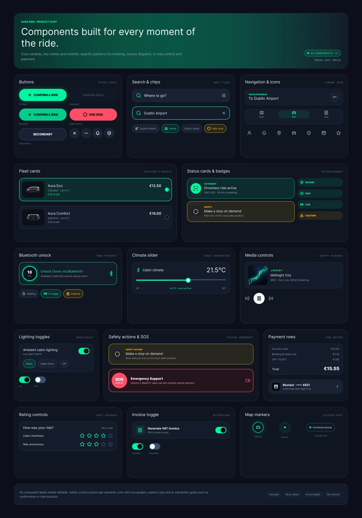
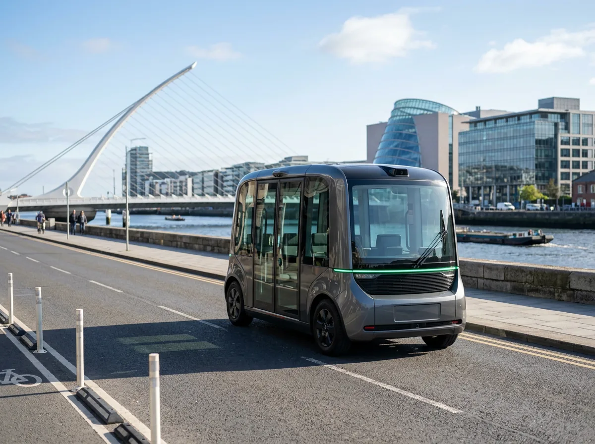
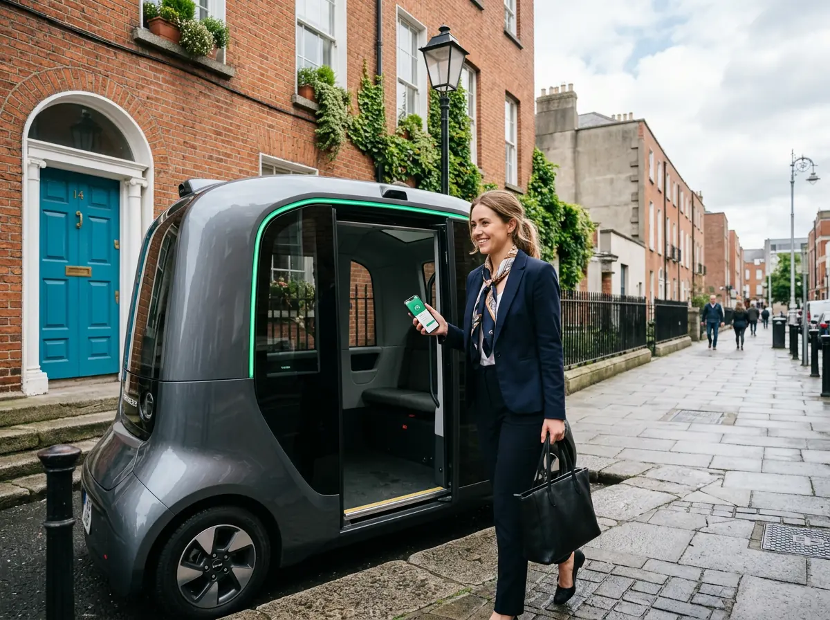
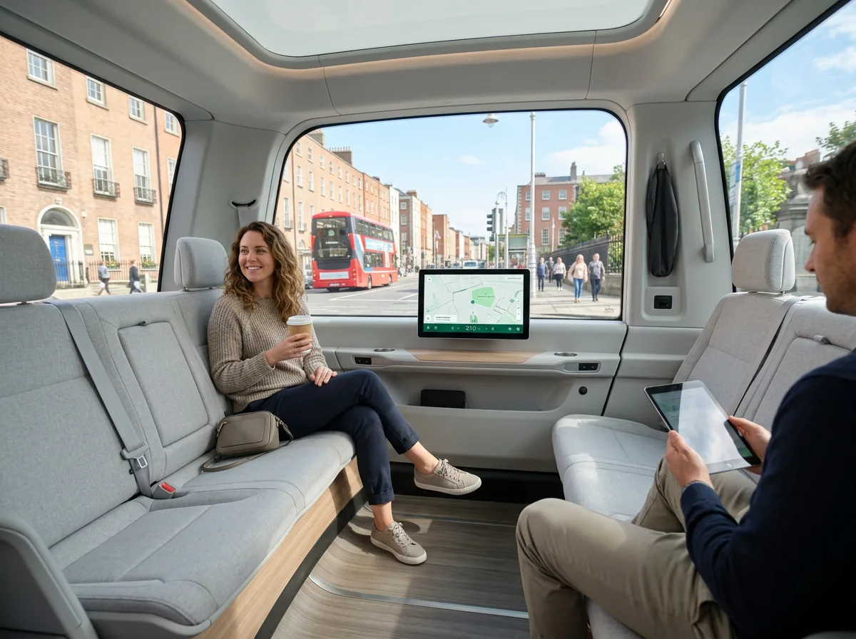
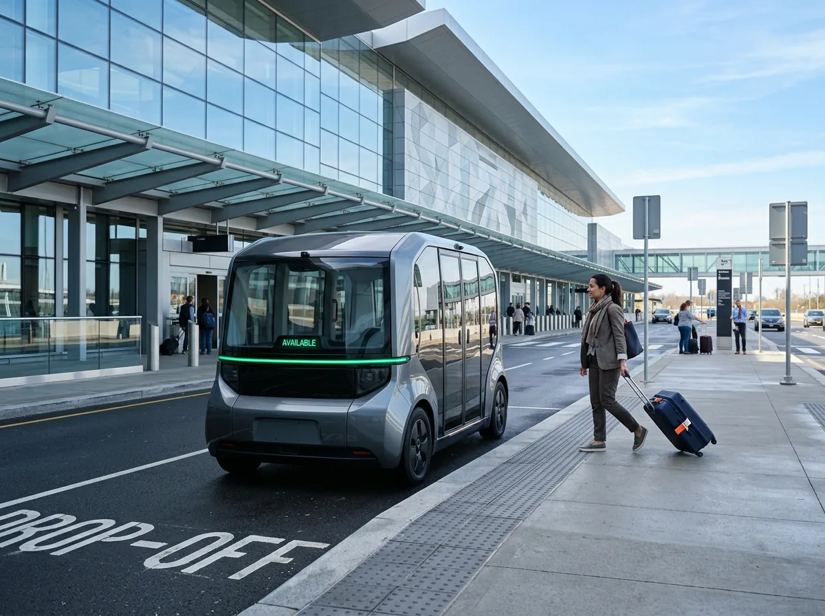
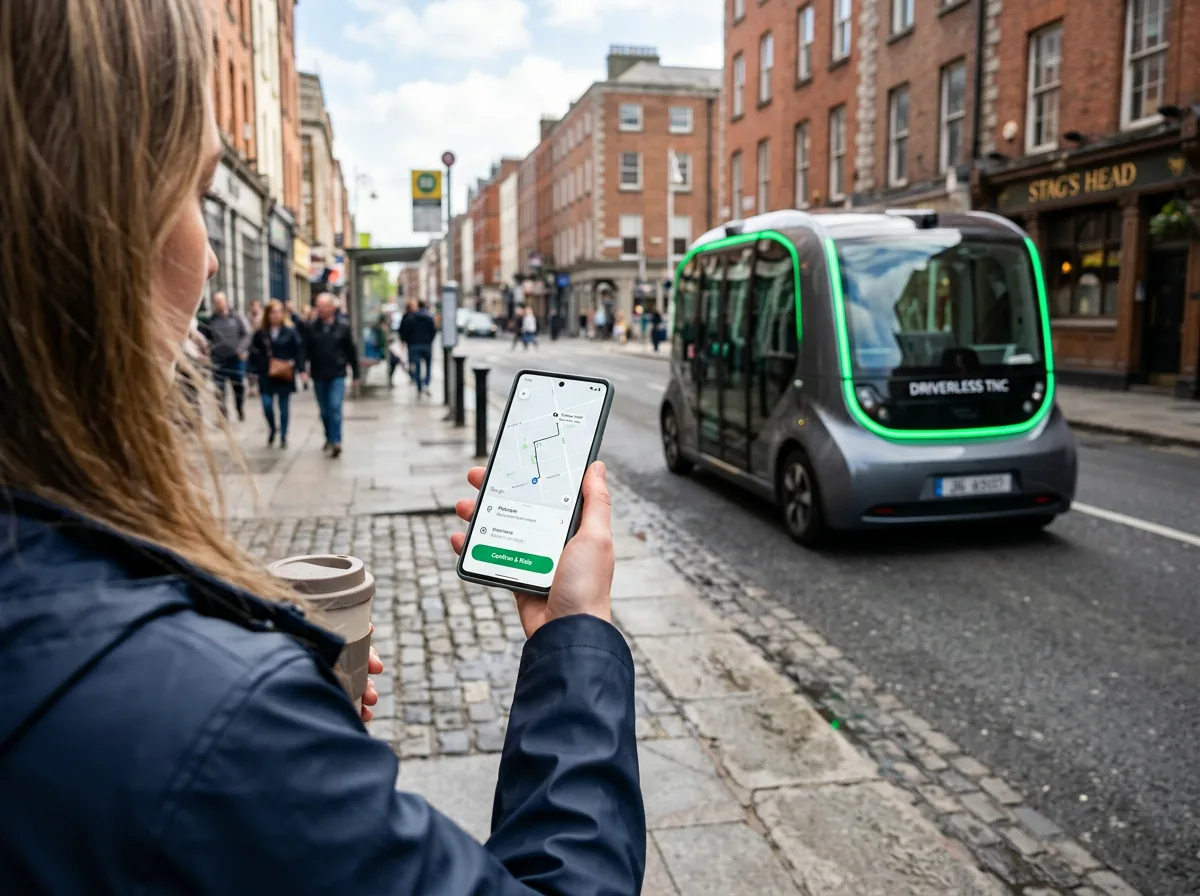
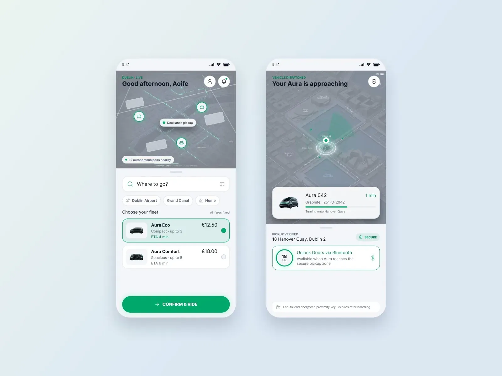
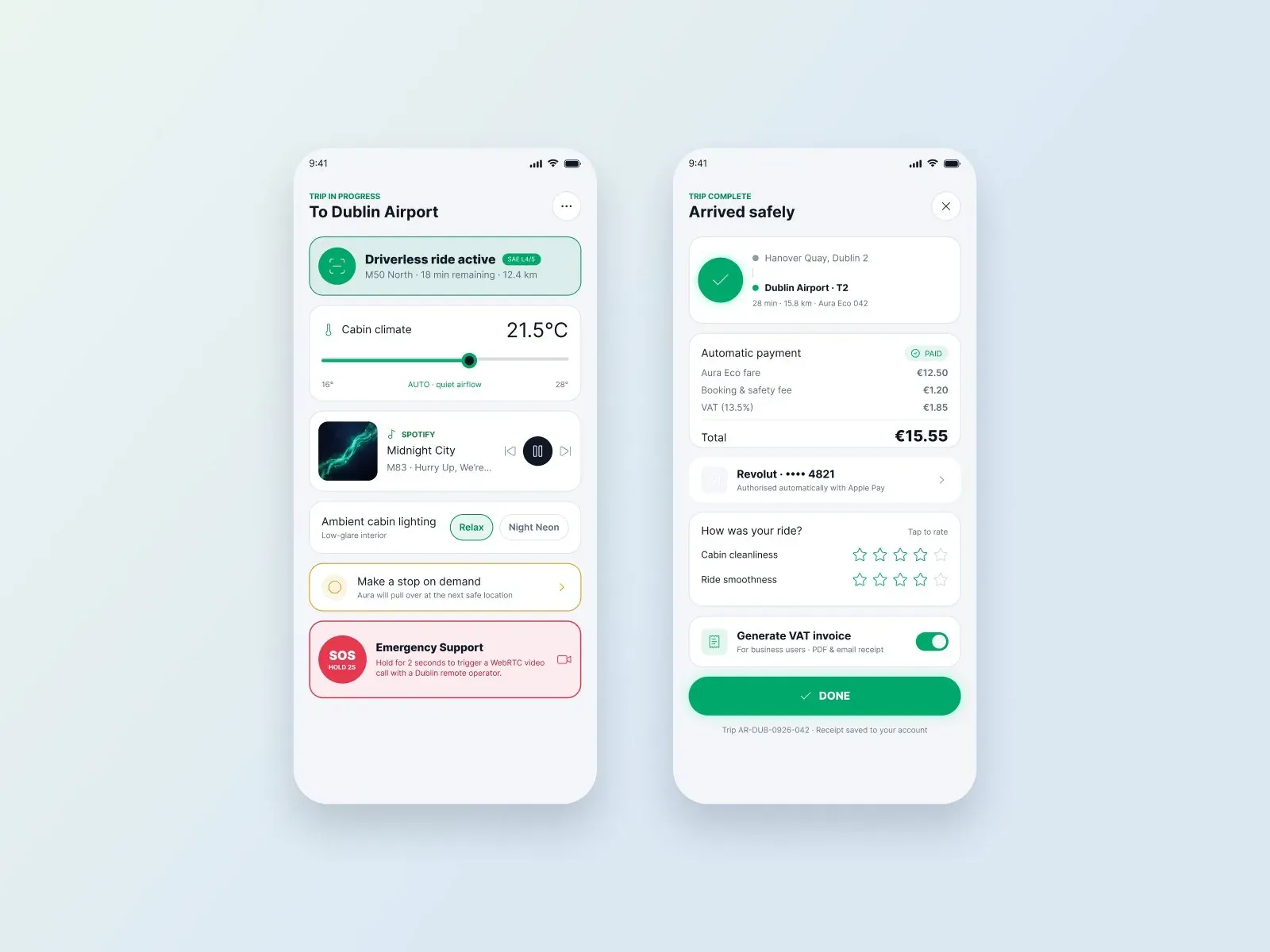
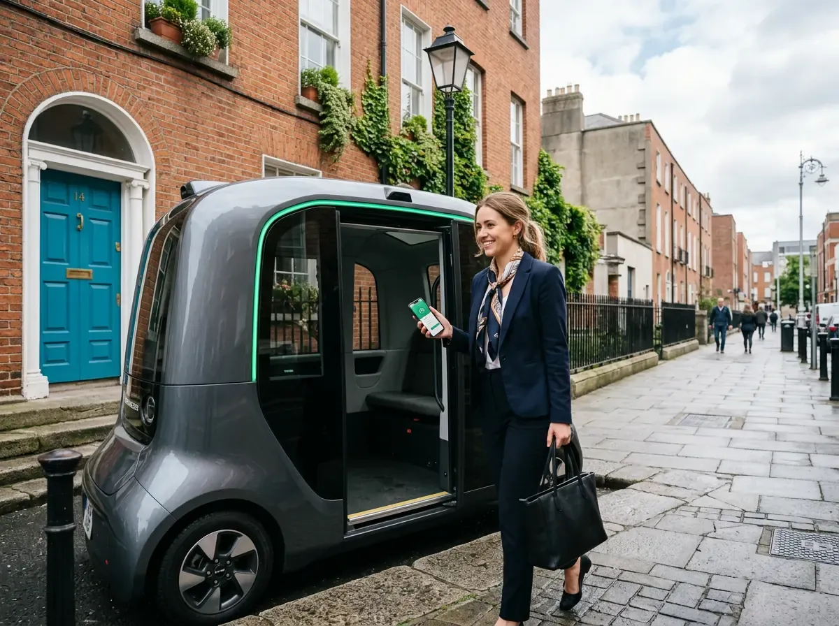
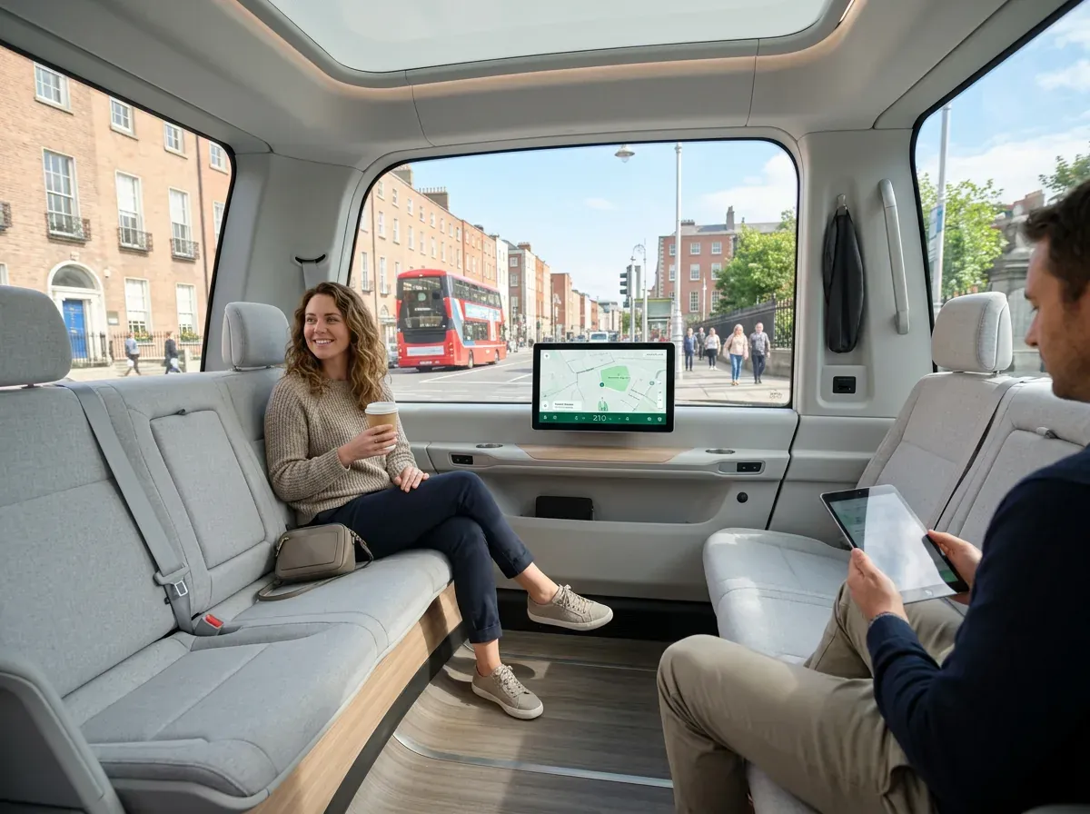
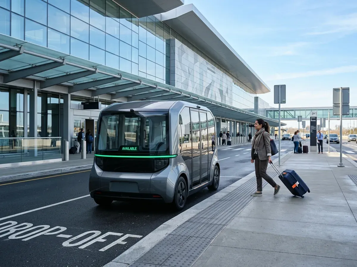
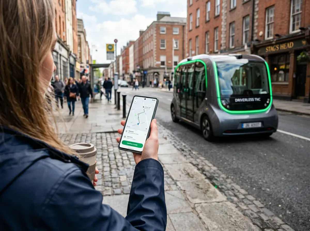
Concept project. Imagery is AI-generated for presentation.
Summary
- A concept for Dublin's premium driverless taxi — quiet, secure and in the passenger's control.
- One continuous journey in four iOS screens: book, dispatch, ride, arrive.
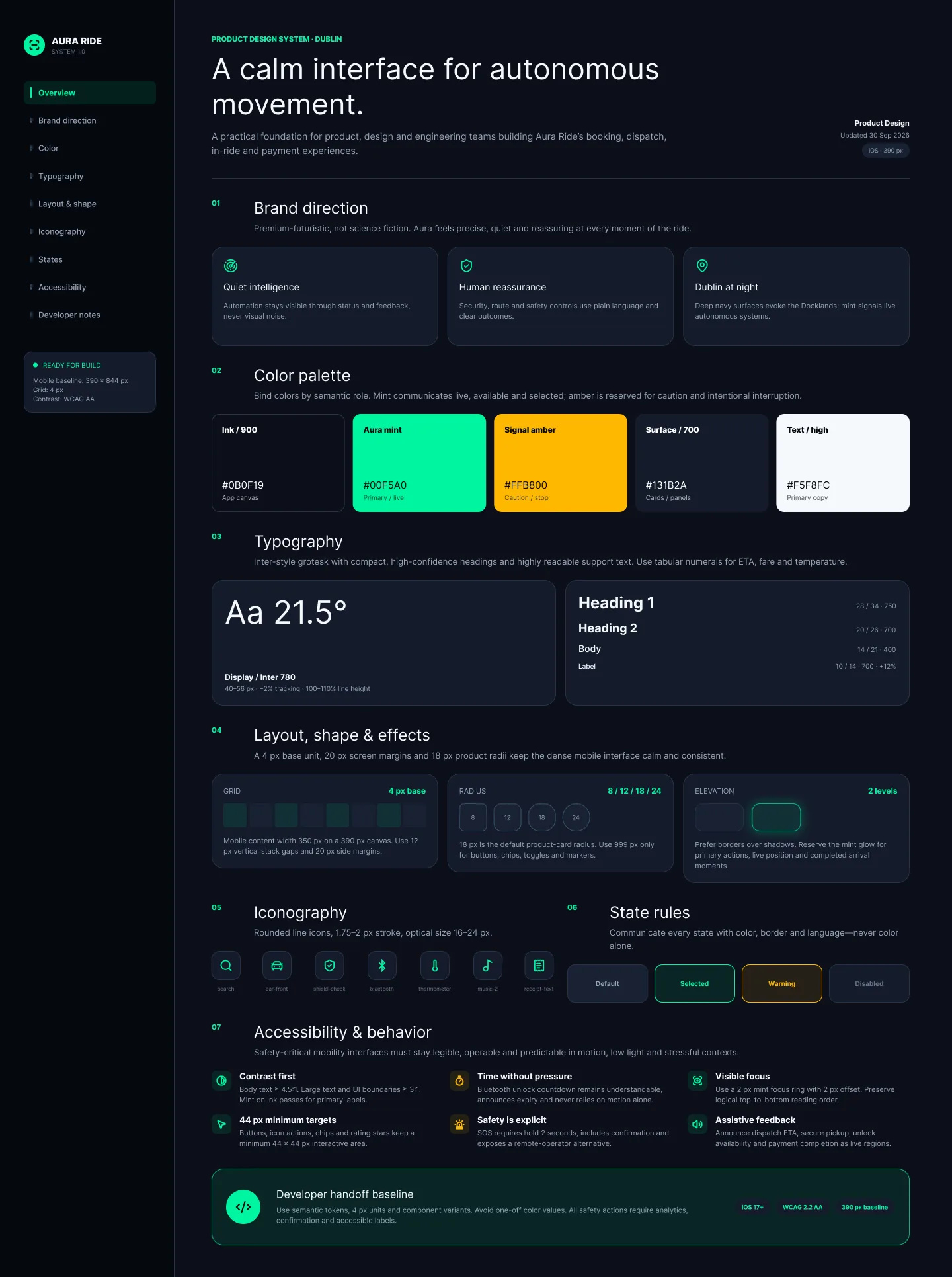
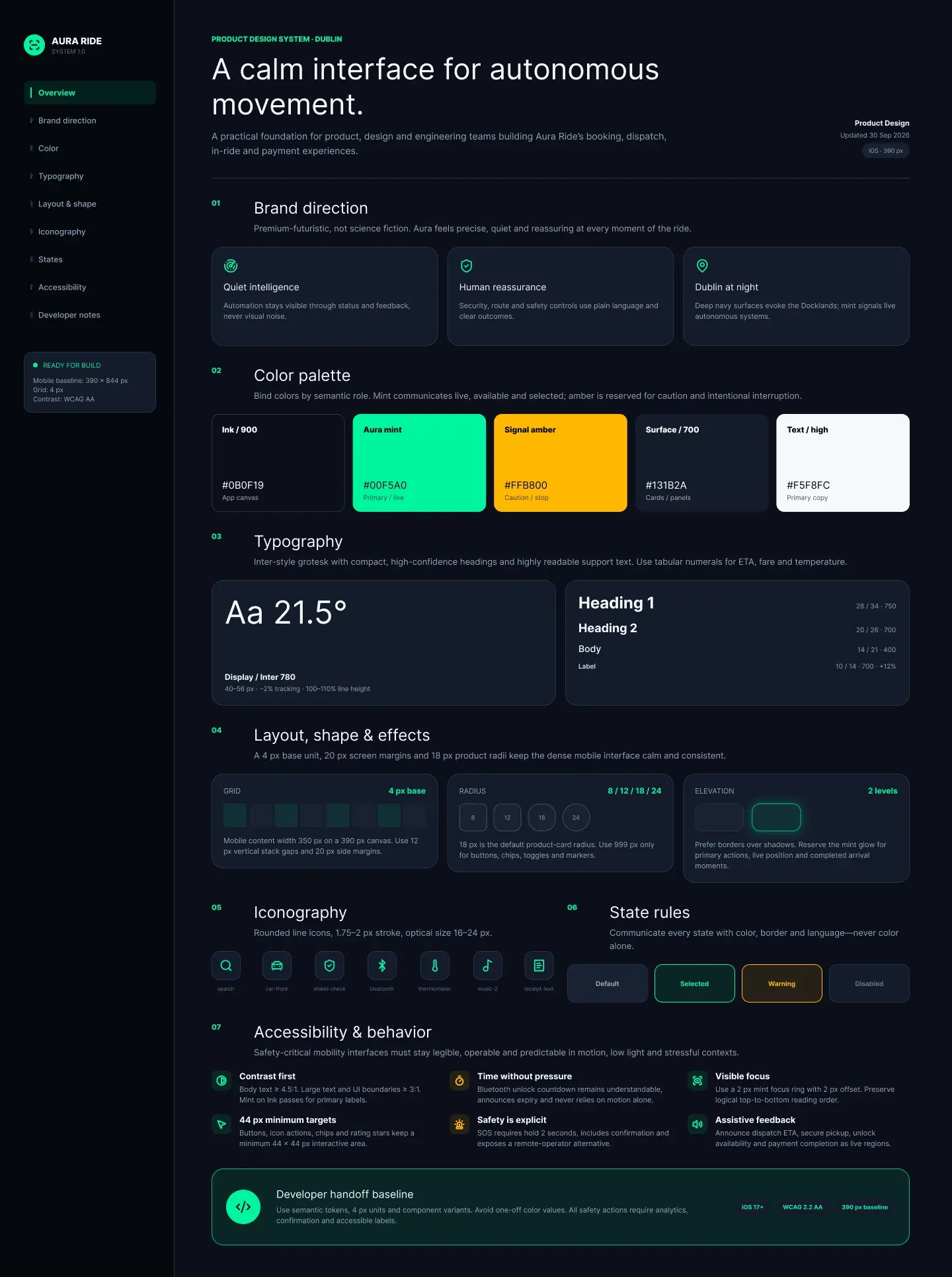
- Built on a 42-component design system with a 4 px grid and strict semantic colour.
The problem
In a driverless taxi there is no one to ask. No driver to confirm it’s the right car, to explain why it slowed down, or to stop when you need to get out. Trust has to arrive before the car does.
Aura Ride is a concept for an SAE Level 4/5 autonomous taxi service in Dublin. The goal: make a ride without a driver feel transparent, calm and unmistakably in the passenger’s control — from booking to receipt.
Research
I framed the product around the moments when anxiety peaks in a driverless ride, and the questions a passenger silently asks at each of them: What is coming? Is it safe? Am I in control? What did I pay?
That gave three design principles: reassure without a driver, explain the car’s intent in plain language, and give back meaningful control — without turning the cabin into a cockpit.
Process
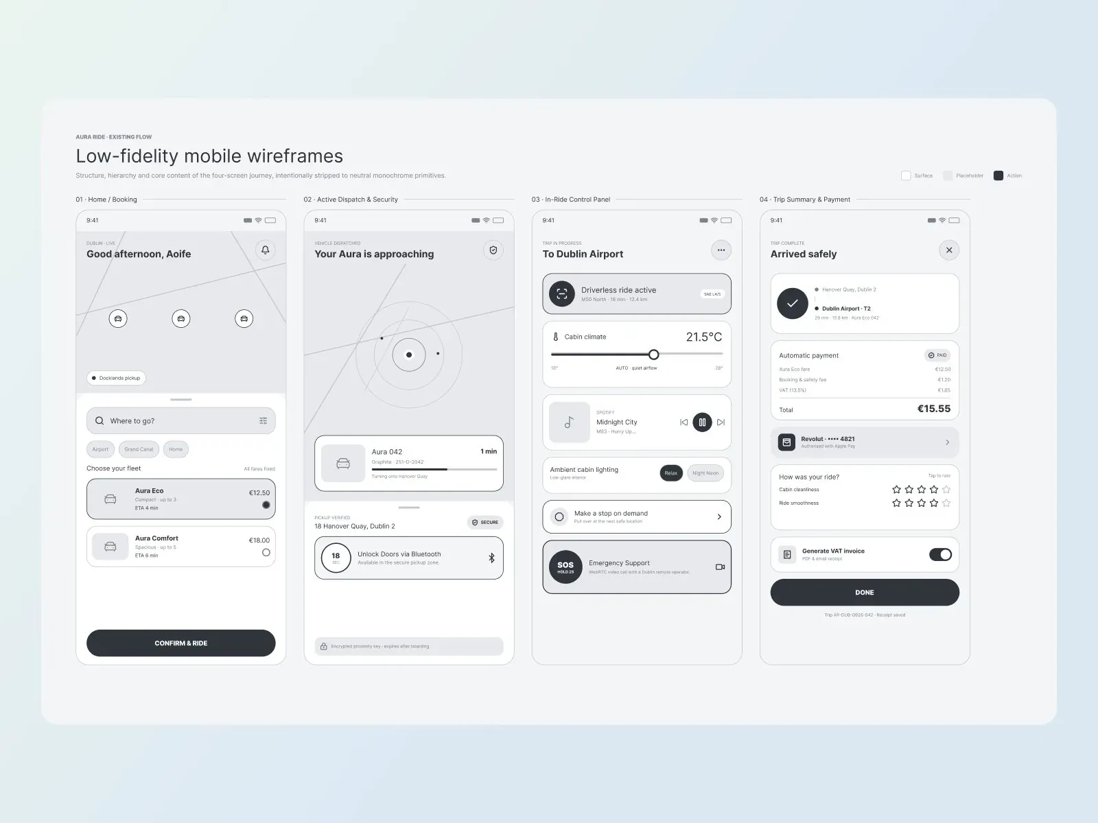
Structure first, atmosphere second. The four-screen journey was built and checked as neutral monochrome wireframes before any status colours, autonomy signals or visual depth were added. Only then did the visual concept and the design system come in.
Key decisions
Security by proximity. Doors unlock with an encrypted Bluetooth key that works only inside the verified pickup zone and expires after boarding — so the passenger knows this is their car, and no one else can get in.
Live dispatch, explained. Vehicle ETA, identity, route and sensor activity stay visible from booking to pickup. The machine’s perception is translated into simple, human reassurance.
Safe interruption. “Make a stop on demand” and SOS are always visible. Amber is reserved only for deliberate interruption, never for decoration, so a warning is instantly recognisable. SOS needs a 2-second hold and opens a video call with a remote operator in Dublin.
Invisible checkout. Payment happens automatically, with a transparent breakdown of fare, fees and VAT, quick ride feedback and a VAT invoice for business users.
Design system
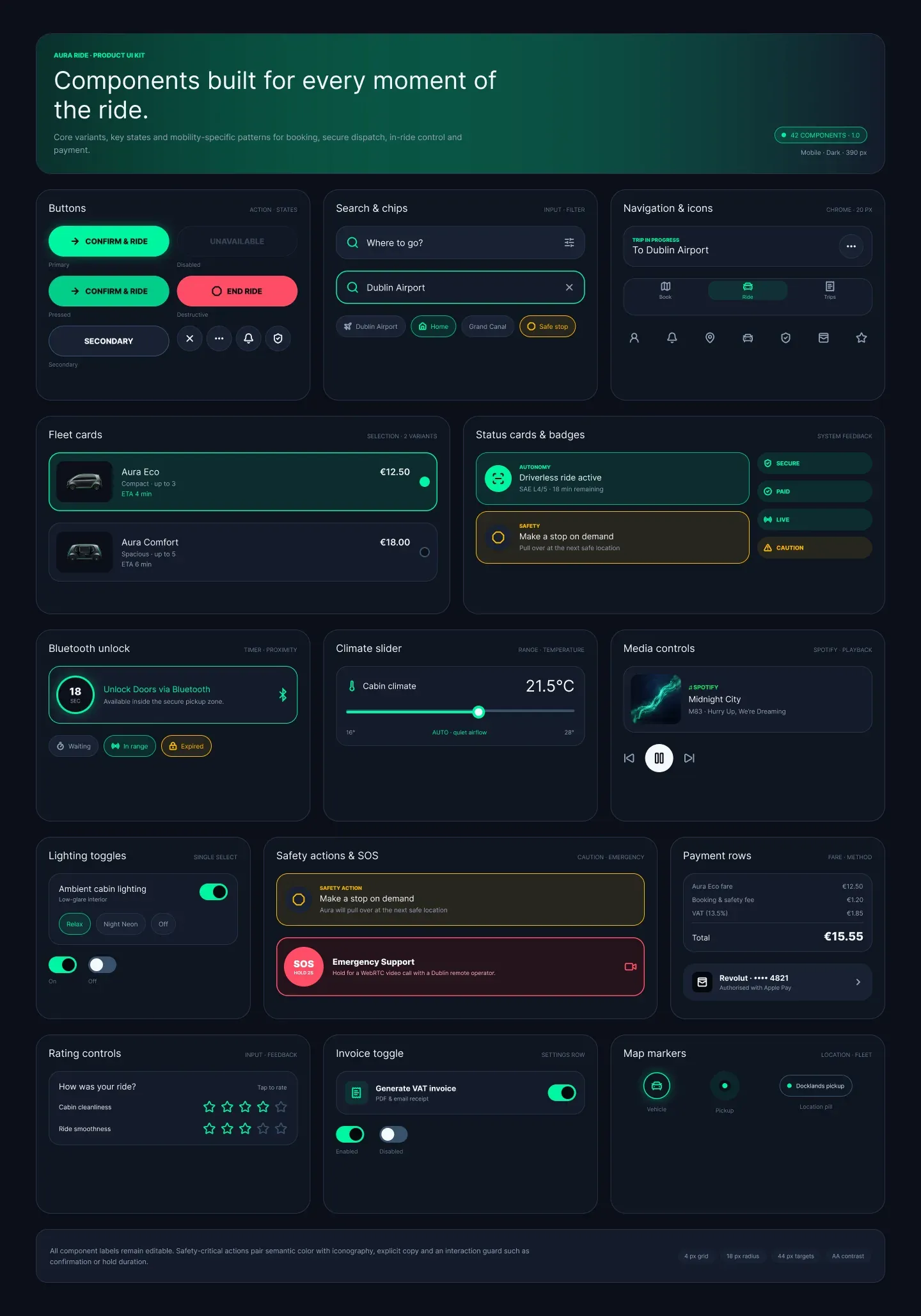
42 components on a single 4 px foundation: buttons and states, search and chips, fleet selection, status cards and badges, a climate slider, safety actions and completion patterns. Semantic colour is strict — emerald means live and active, amber means caution only.
The design
Four core iOS screens (390 × 844) carry the whole ride: Home & booking, Active dispatch & security, In-ride control panel, Trip summary & payment. Each screen holds one clear mental model.
The original product uses a dark night theme inspired by the Docklands after rain. For this portfolio I also created a light daytime version of the screens.
Validation
I walked 2 people through the prototype end to end — booking, waiting for the car, the ride itself and payment — and watched where they hesitated or asked questions. It was a small test, but enough to check that each screen answers its one question clearly.
Outcome
A complete concept: positioning, user flow, wireframes, four high-fidelity screens, a component library and visuals that show the service in real Dublin streets.
What I'd do differently
Dublin is not an empty test track. Next I would design for its narrow historic streets and its traffic: smart pickup points on streets where the pod can stop safely, a short walking guide to that point, honest ETA ranges instead of a single number when traffic is heavy, and a plain-language explanation whenever the route changes. I would also test with more people, including older passengers and people travelling with luggage.